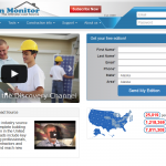
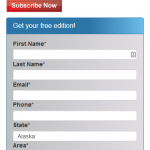
Construction Monitor is rolling out what’s called a “responsive” design. Responsive design is a recent trend in websites that focuses on making one site work well on many devices and screens. In short, the site responds to the device it is being displayed on.
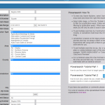
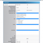
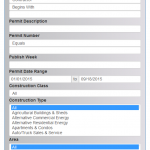
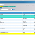
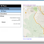
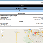
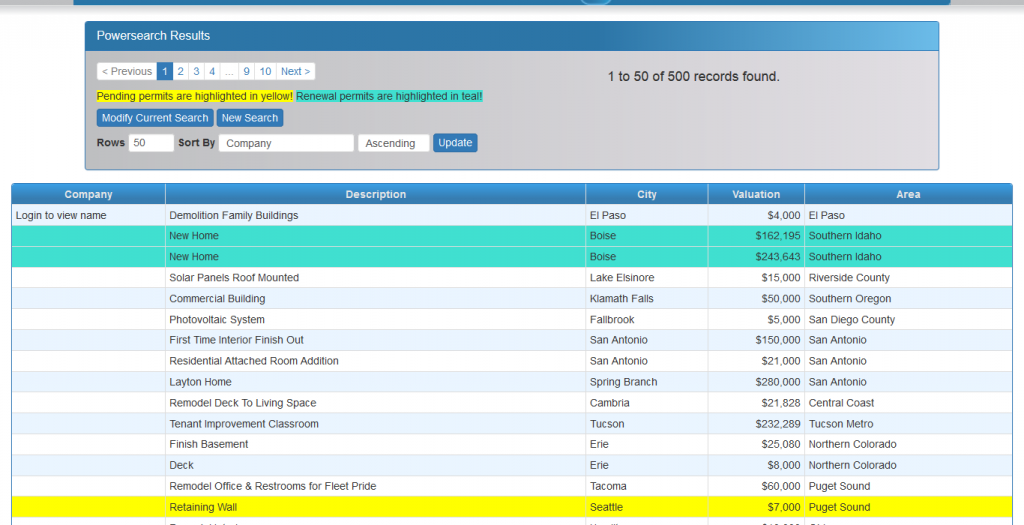
No matter if you are using a great big display on your work computer, or on the go with a small smartphone, the new Construction Monitor site should scale and fit that screen fairly well. We’ve included some screenshots so you can see how the home page and some of the tools will differ on different media.
If you’re not a big technology junkie, and just care that a thing works (not how it works), give our new site layout a try. If you have any questions, concerns, or something isn’t working right for you on the new design. Give us a call (435-586-1205 x0), or shoot us an email ([email protected]), we’ll get it sorted out.
If you are a bit of a technology junkie, and love how to know how things work, technical bits ahead!
Our new layout started with Twitter’s bootstrap. We then tweaked it, a lot. For us, we used their LESS download package, and added a new LESS sheet that contained all of our adjustments. This makes it easy to update as bootstrap updates, and easy to see where all of our own adjustments are.
The total amount of CSS we’re using on the site hasn’t changed much (in fact it might have gone up some), but what has changed is the amount of CSS we had to write. Our old style sheet was 2500 lines, our new customization only sheet is 600 lines. And the ease of updating is greatly increased, LESS (and SASS) support a great number of tools to speed up designers work on styling websites.
Alongside updating the stylesheet, we had to update and replace some of the HTML and CSS classes we were using. The last site layout we did was in 2010/2011. We’ve learned a lot since then, and didn’t always make the right choices. Going through the site in this manner gave us a good opportunity to fix some of that, and gave me even more things that weren’t broken, but weren’t quite right to fix in the future.
Everything wasn’t smooth sailing though. We ran into our fair share of roadblocks, including not knowing CSS as well as we thought we did, and losing support for Internet Explorer 7 and (and to a lesser extent 8). We have very few customers still using our site on those browsers, and we felt the trade offs are worth it. Our mobile visitors rise every month, and we want to give them an experience that’s good, instead of mediocre (or sometimes downright bad), like our old mobile site offered.
We’re also aware that it’s not going to be easy for everyone to make the adjustment, change is hard, and it’s never fun when something you use gets an update and becomes harder to use. We hope that we haven’t made it any more difficult to use, and by and large our tools haven’t changed except for cosmetic updates. We feel like in the long run, even these cosmetic changes will lead to better ease of use though.